The brief
Under new ownership, Johns Print Centre was ready for a fresh direction. Its dated branding reinforced the perception of a traditional printing company, while the business was expanding its capabilities and looking towards new technology.
The brief called for a modern identity using deep purple and orange. The rebrand needed to challenge existing perceptions and communicate that JPC offered more than print.
The approach
I developed the identity around the shortened JPC name, giving the business a more concise visual presence without losing its connection to Johns Print Centre.
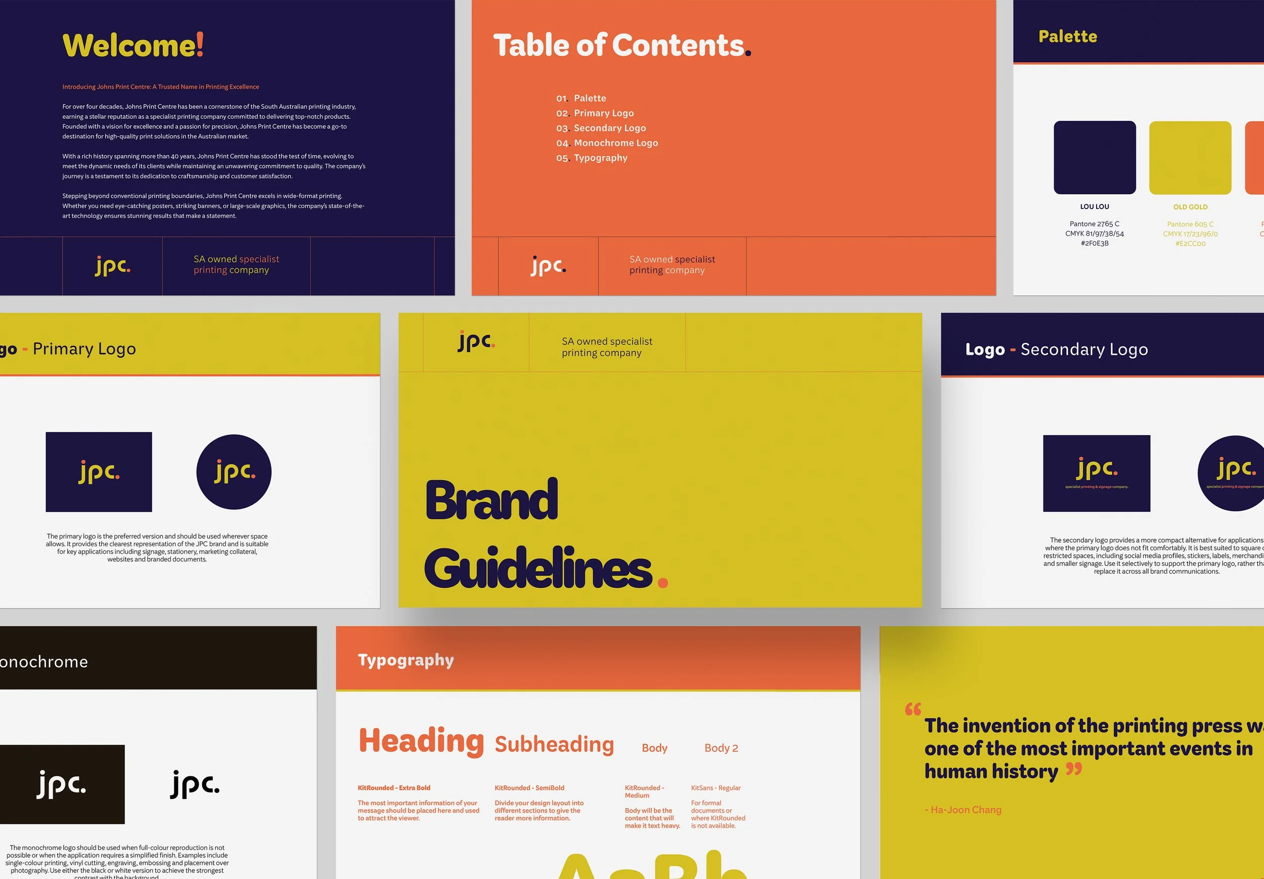
Deep purple and orange formed the starting palette. I introduced yellow for contrast and energy, creating a bold combination that would stand out across digital platforms and physical applications.
The identity
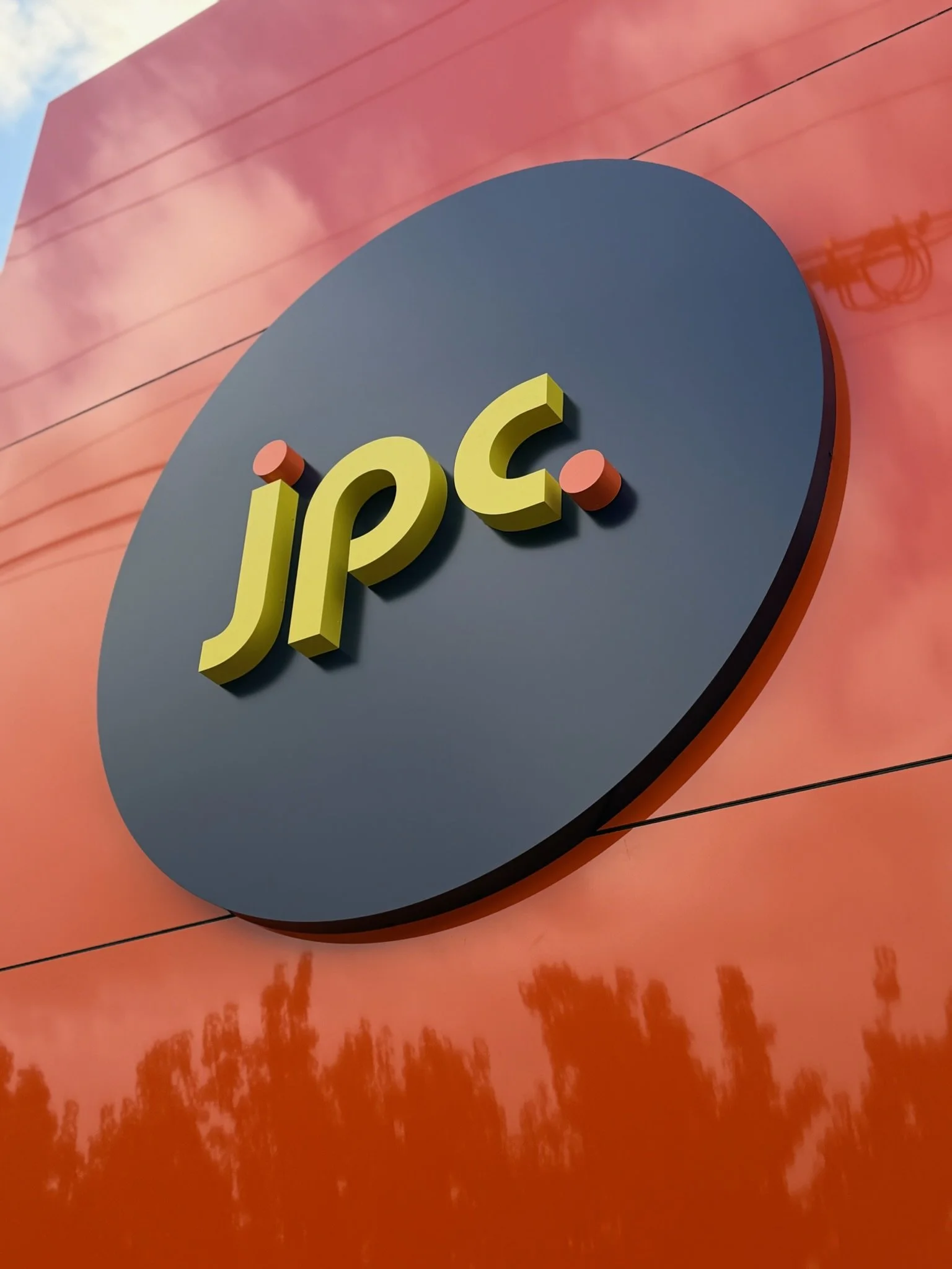
The lowercase wordmark uses rounded, geometric letterforms to create a contemporary and approachable feel. Orange accents—the dot above the “j” and the full stop—bring personality to the mark, while yellow lettering stands confidently against deep purple.
A circular logo format provides a compact version for applications such as social media profiles. Together, the simplified name, distinctive letterforms and bold colours give JPC a recognisable identity that supports its broader offering and future direction.