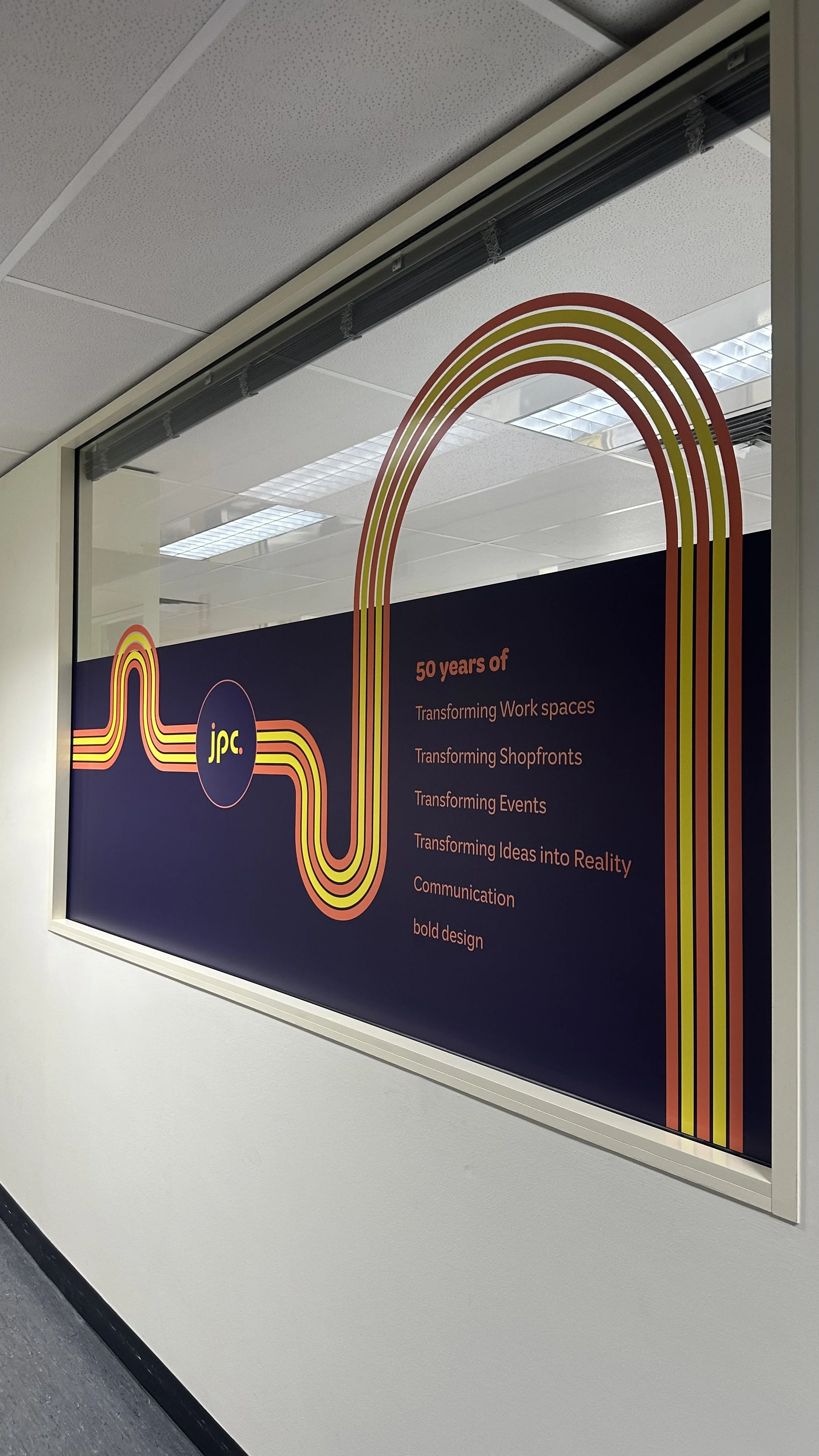
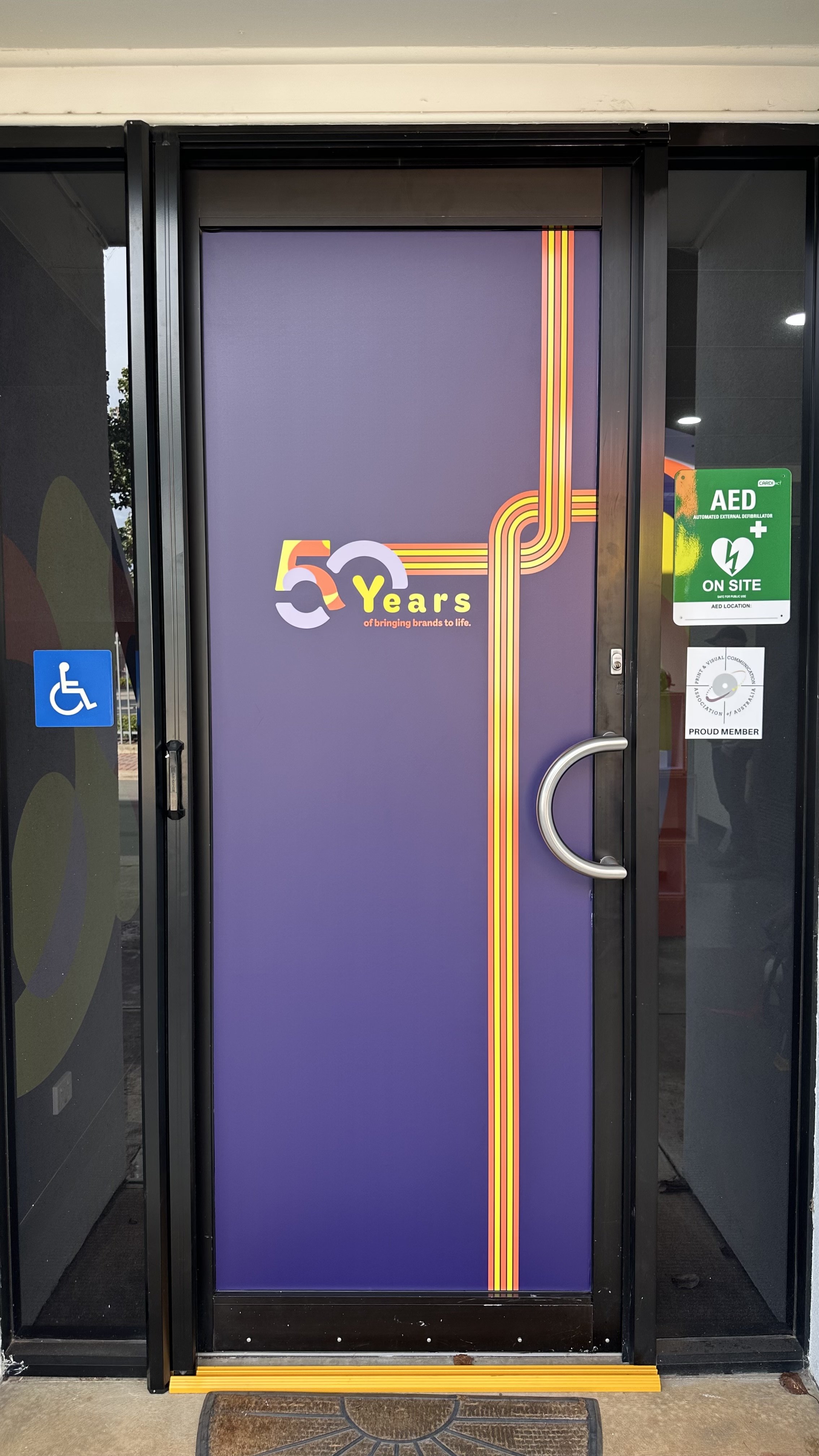
The brief
Johns Print Centre wanted to celebrate its 50th anniversary with a campaign inspired by the 1970s—the decade the company began.
The campaign needed to recognise JPC’s history while creating a consistent presence across its digital channels, installer vans and premises.
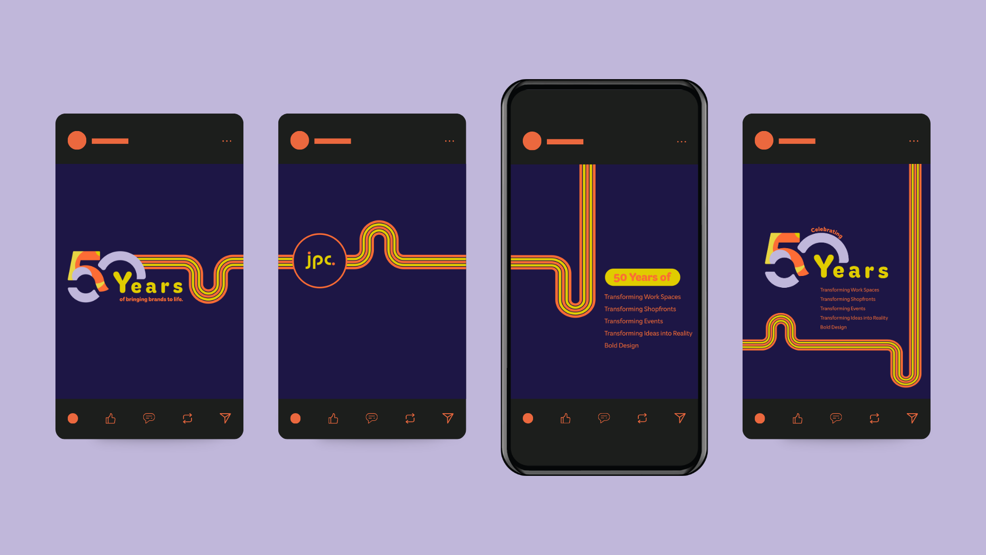
The approach
I developed the campaign concept, creative direction and graphics, using research into 1970s design to inform the visual approach. The flowing, parallel line graphics associated with the era became a central element, reinterpreted in JPC’s brand colours to connect its beginnings with its current identity.
The message centred on “50 years of…”—transforming shopfronts, events and workspaces. This shifted the focus beyond the anniversary itself to highlight the breadth of JPC’s work and its contribution to South Australian businesses.
The accompanying blog content celebrated the people behind that history, highlighting long-serving team members and longstanding client relationships, including Foodland.
The creative
Flowing multicoloured lines, bold typography and a custom anniversary graphic formed a flexible campaign system. The lines could weave through different layouts, giving each application a recognisable connection without repeating the same composition.
I adapted the creative across email signatures, website assets, social media graphics and blog content, alongside installer van decals and window and door graphics at JPC. Together, these applications connected the digital campaign with the physical business, making the milestone visible online, on-site and out on the road.