The brief
Three years after closing its Tanunda café, Red Door Espresso was preparing to reopen under the same owners in a new Gawler location.
This was a new chapter for the business, with a more focused concept centred around coffee, bagels and pastries rather than its previous all-day breakfast offering. The brand identity needed to acknowledge the familiar Red Door name while giving the new location a simpler, more modern and confident presence.
The approach
The red door remained an important part of the brand’s story. The new café features a vintage red door displayed inside, an old red car door and a distinctive red entrance.
These details became the foundation for the identity. I simplified the door into an arched symbol that could sit alongside the wordmark or work independently as a recognisable brand mark.
The identity
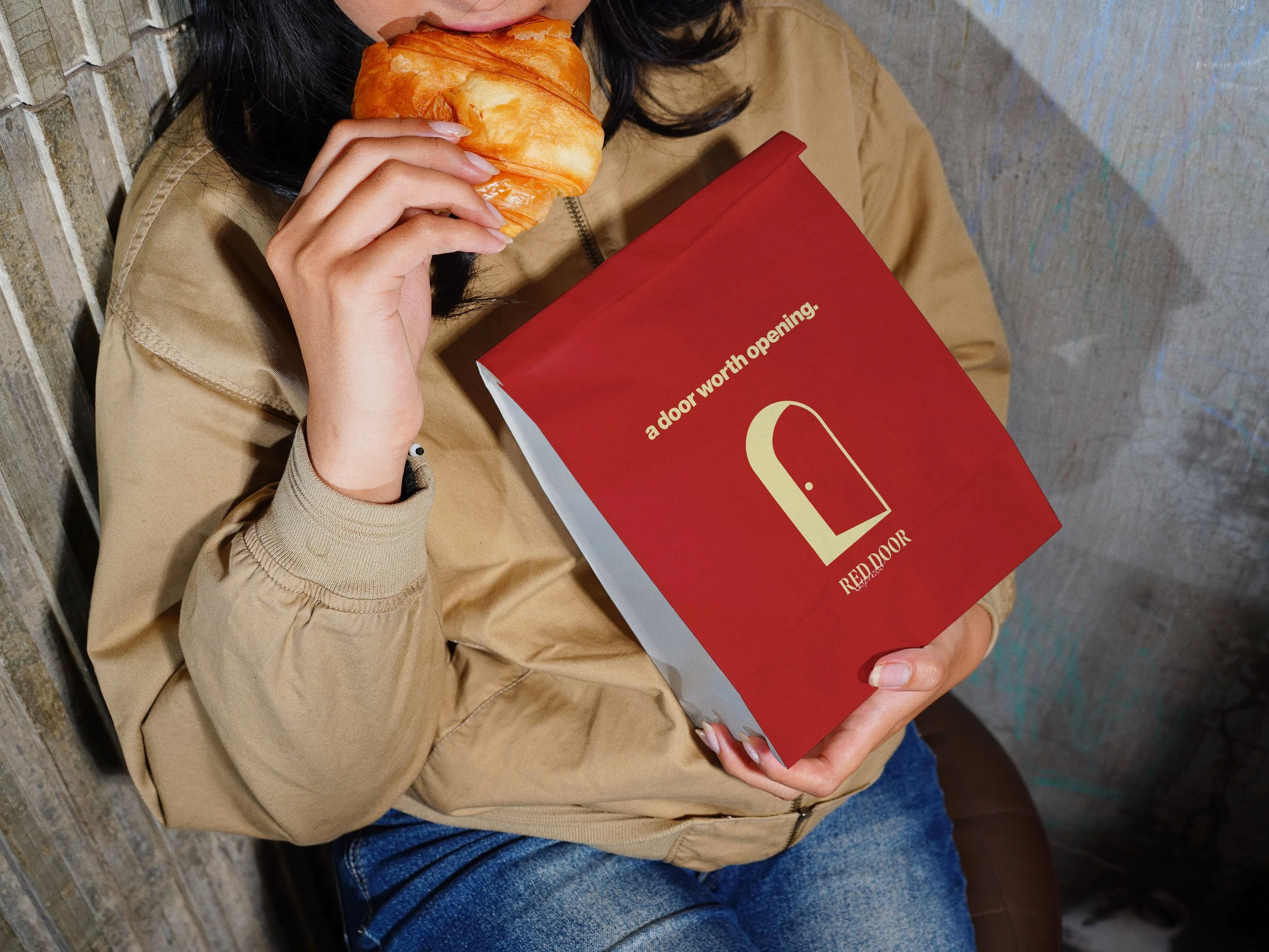
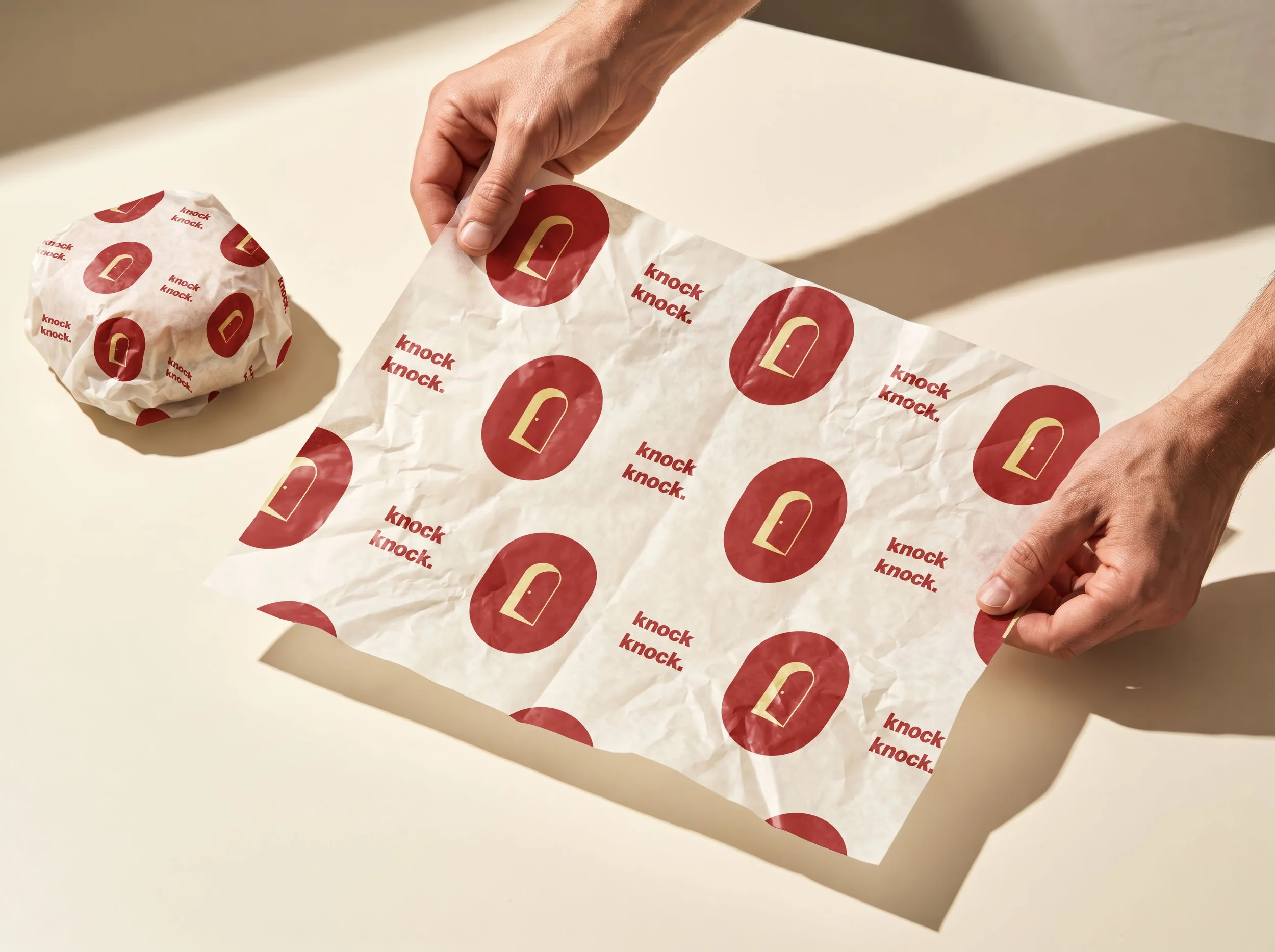
A rich red leads the colour palette, supported by creamy beige, butter yellow and white. The combination feels warm and welcoming while giving the brand a bold, contemporary look.
A characterful sans serif typeface gives the wordmark personality while remaining clear and easy to read. Paired with the standalone door symbol and playful brand language, the identity feels familiar enough for returning customers while clearly signalling that Red Door has entered a new era.
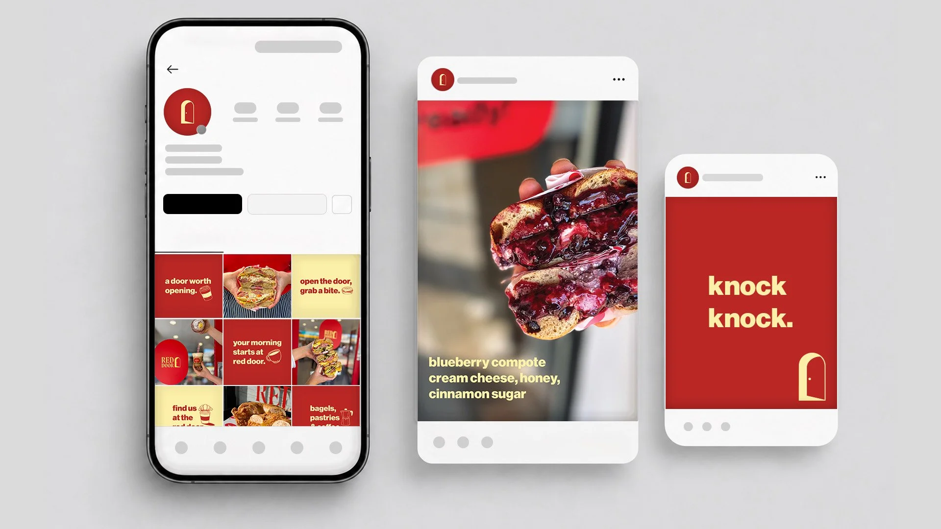
The flexible visual system works consistently across packaging, social media and digital content, creating a recognisable identity at every brand touchpoint.