
The brief
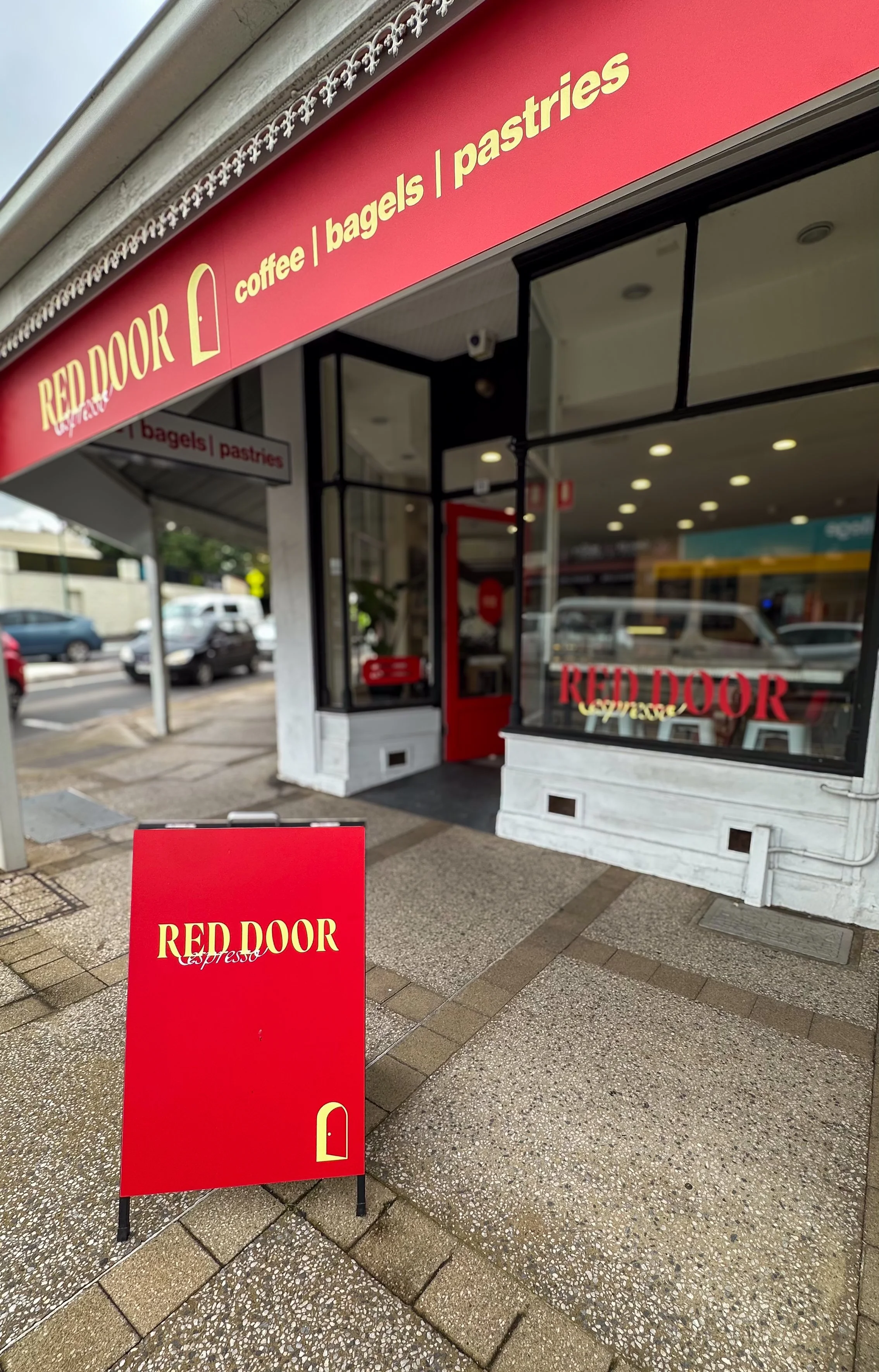
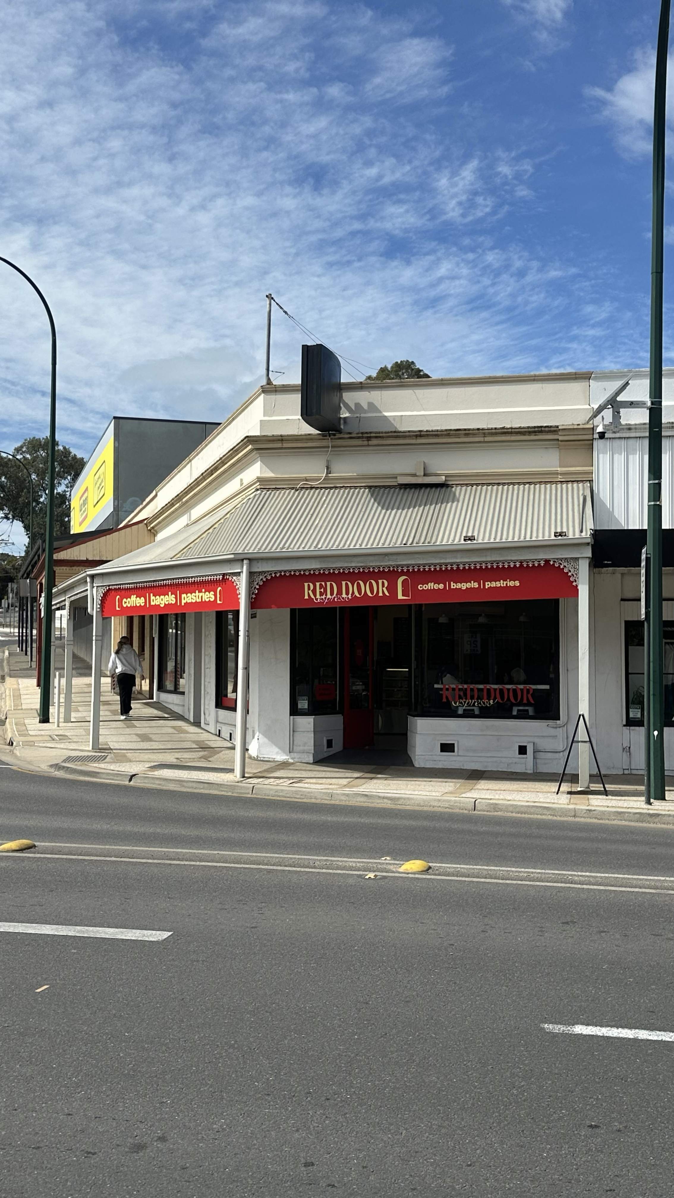
Red Door Espresso’s new Gawler location needed signage that would attract attention from the street and clearly communicate its offering: coffee, bagels and pastries.
Positioned on a busy intersection, the corner shop required a cohesive presence across both street-facing sides while meeting council and traffic department requirements.
The approach
I recommended suitable signage for the building and developed the designs, considering visibility for passing traffic, customers approaching on foot and the natural light inside the café.
I worked closely with council through the approval process and collaborated with JPC to execute the design. JPC recommended materials and production methods that would achieve my creative direction within the site’s restrictions.
The creative
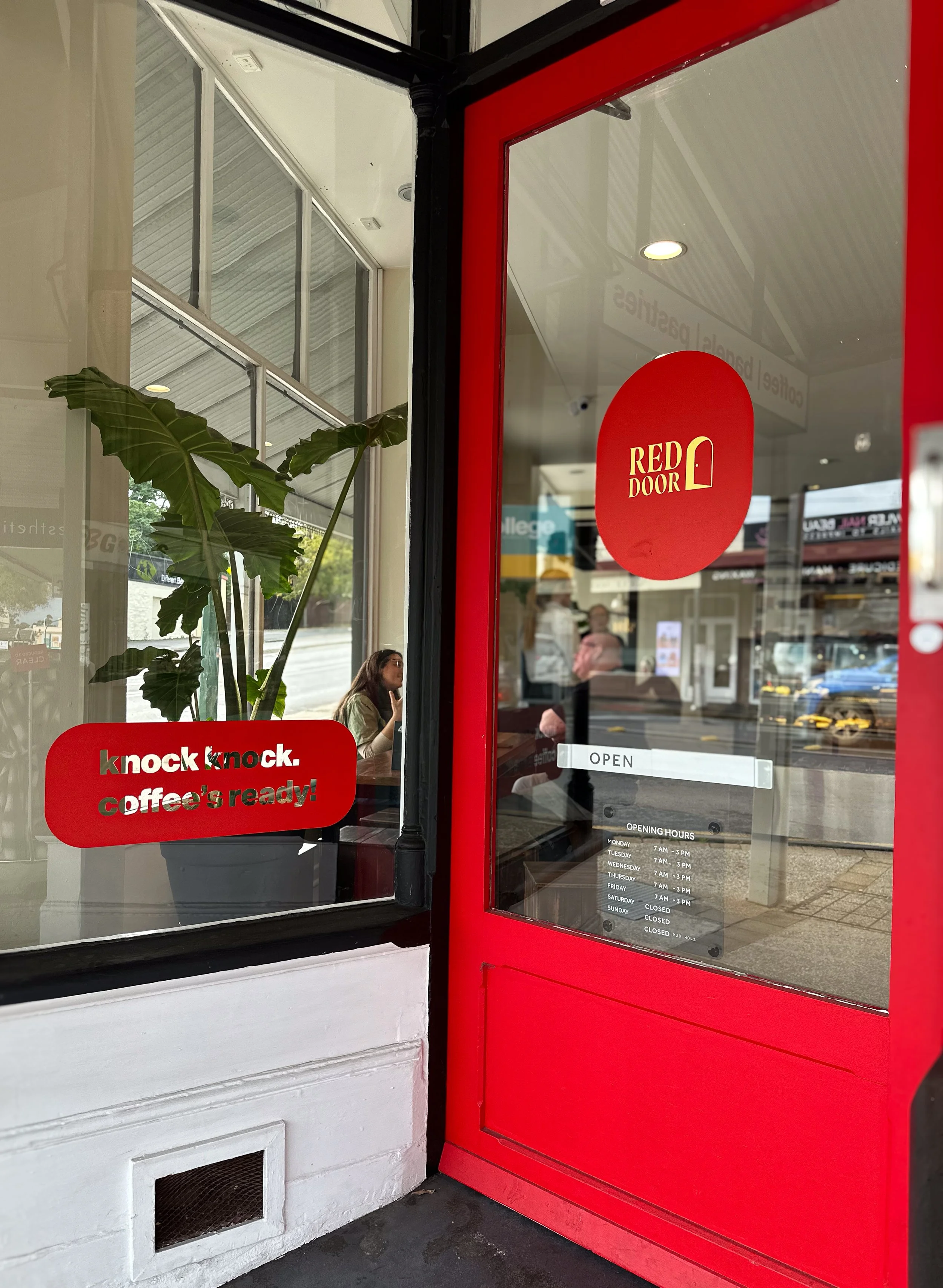
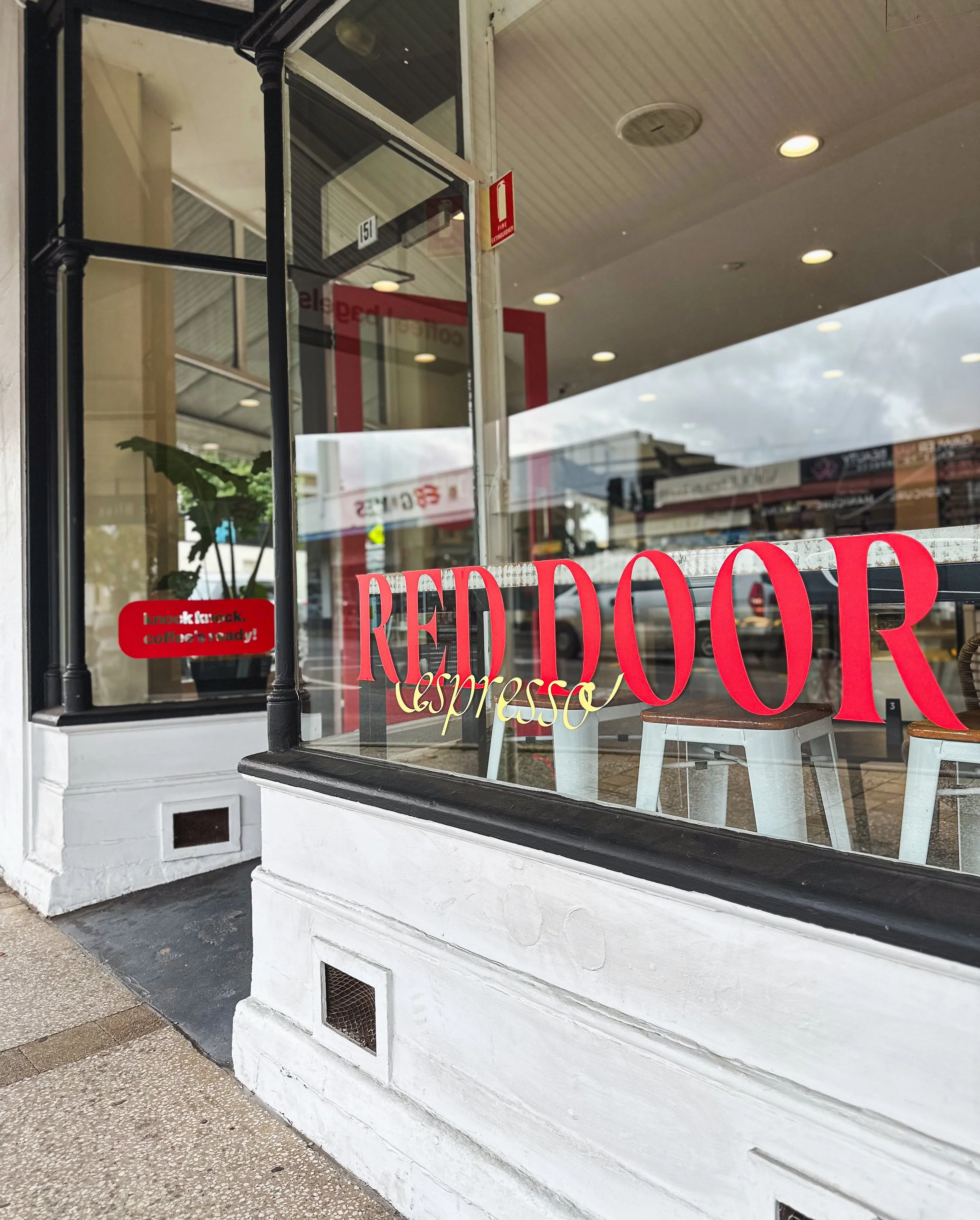
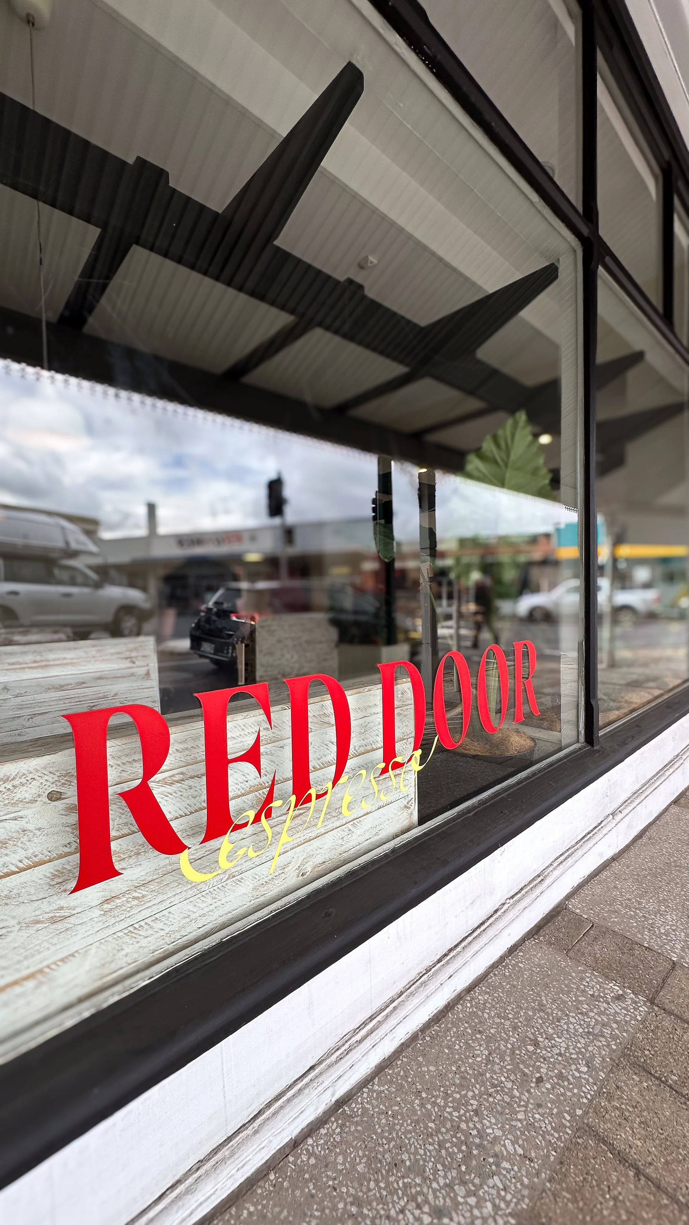
The suite included two ACP shop signs, lightbox inserts, window and door decals, and an A-frame. Red and butter yellow connected the signage to the brand identity, while prominent typography and the door symbol created a recognisable presence.
The main window decals had no solid backing, allowing natural light to continue entering the café. A red strip decal with a small logo connected the rear window to the rest of the corner shop, extending the identity around the building and tying the overall design together.
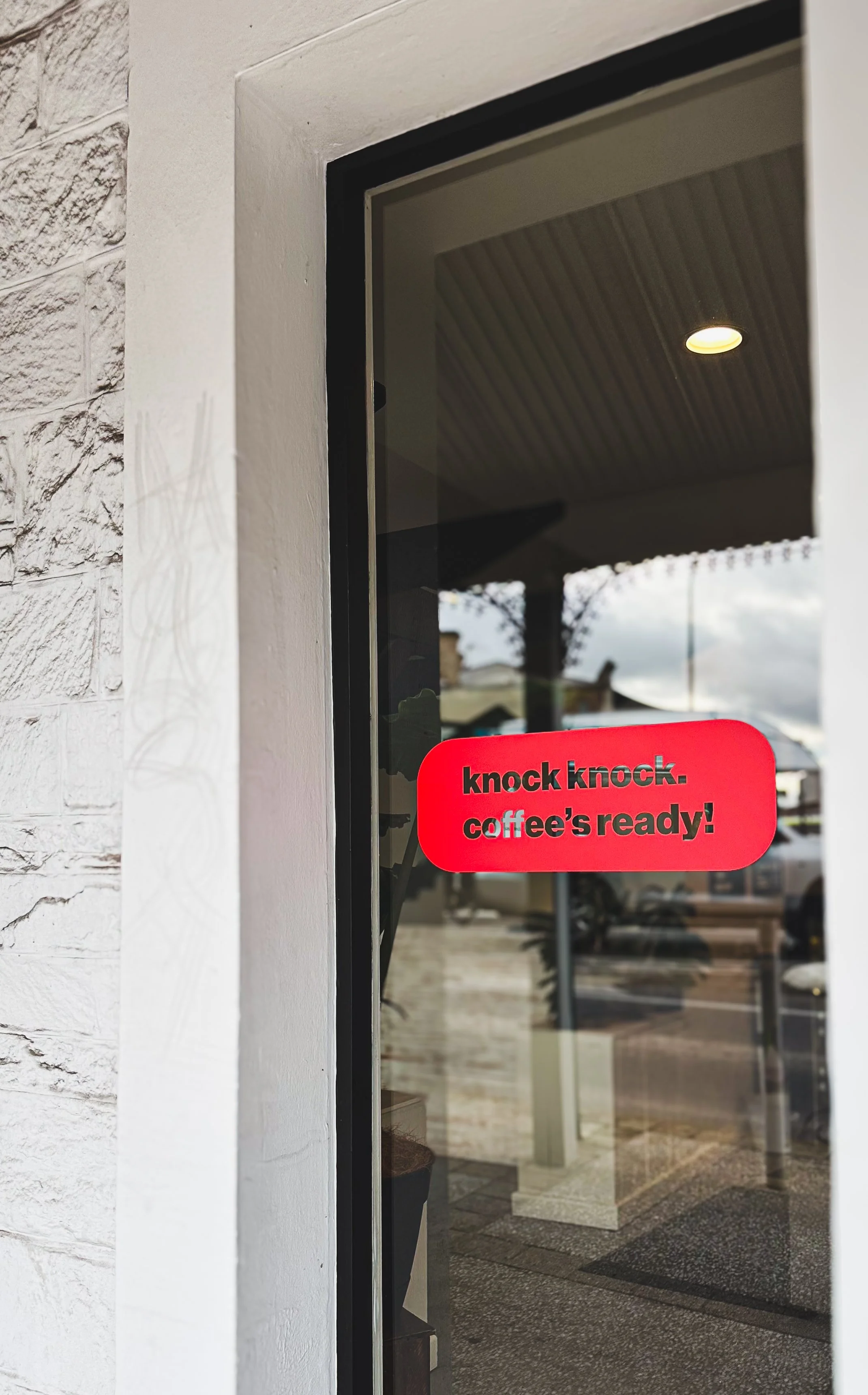
Playful messaging such as “knock knock. coffee’s ready!” added personality at street level. JPC printed and fabricated the final signage, combining their production expertise with my signage design and direction.
Signage printed and fabricated by Johns Print Centre (JPC)